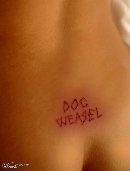
docweasel’s first foray into one the notorious Worth 1000 Photoshop contests is an old image that didn’t follow the guidelines, broke the rules and wasn’t even a Photoshop of what it was supposed to be, but still beat nearly 2/3rds of the Worth 1000 veterans who contributed. We didn’t even use Photoshop, with all its bells and whistles and macros and filters, instead using a nearly 10 year old version of Paintshop Pro. Imagine if we’d tried!
Regrettable Tattoos 8
You’ve seen them– the hula girl on your baby-blue sweater wearing grandpa’s bicep… your uncle’s ex-wife’s name emblazened across his chest in a circle of hearts and flowers… that tweetie bird on your butt.. In this contest, your task is to show us a tattoo on someone’s skin (not just the design– it must look like it’s been tattooed onto a person) that the owner subsequently regretted. The reason for the regret must be obvious.
The rules of this game are thus: Create a believable, regrettable tattoo. As always, quality is a must. We will remove poor entries no matter how much we like you. You’ll have 48 hours for this contest, so make your submission count.
Total Score: 292
Avg Rating: 4.787
Weighted Avg: 4.797
# of Votes: 61
Rank: 27/70
Grade: B-
Views: 79196
Comments: 1
E-mails: 0
Favorites:0 [+]
Wow, 27th out of 71, not too shabby seeing as I thought for sure we’d be DQ’d because 1. its not a tattoo at all, its a cutting, related, but not strictly within the guidelines and B. the entry includes the screen name very prominently, which is expressly against the rules also.
Your entry (must not) contain[s] a visible signature. If you want to sign your work, embed or hide your signature in your image so that it’s ‘invisible’ (unobtrusive to the casual viewer). Don’t add obvious signatures or sig-images to your images. (Photoshop and Photography only)
The reason it does is that it was created many months ago for a comic book cover, and it was felt it would work for this contest. Messed around a lot with how much and how dark the “pinkish” area around the entire cut should be, as well as the raised pink skin right next to the cutting itself.
docweasel is self-deprecating enough to appreciate that a lot of the positive votes may have been more appropriately attributed to the beauty of the model’s back and backside, rather than any particular photoshopping skillz of the creator.
Also, Jasc Paintshop Pro 7.0 was used, not Photoshop, which is now so full of plug-ins and filters that the amount of talent or art needed to use it for this type of contest is increasingly nil.
Thanks to all who voted for it, by the way.

