Dismayed by the dolorous Cadillac hearse graphic heading my good friend Joe Tobacco‘s wonderful blog Cadillac Tight
I attempted something vintage yet spirited, evocative of a simpler time and purer values, when cars were reliable and everyone supported the troops, both Democrats and Republicans were united foursquare against the forces that would destroy our great country if they could, when girls were girls and men were men. Mister, we could use a man like Herbert Hoover again.
And even though back then, boy, our old LaSalle ran great, so did the vintage Caddy.
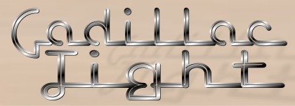
Here’s the header I created for Joe. You can see it in its full glory adorning the header at Cadillac Tight. I’m proud to say, Joe liked it and uses it daily.
I used this 1948 Cadillac:
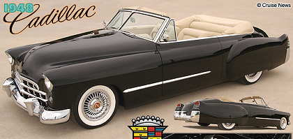
(click for larger image)
I used Lost Wages font, reminiscent of vintage chrome automobile lettering:
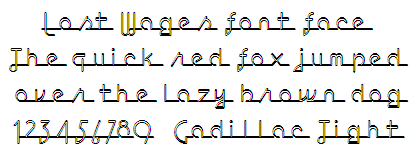
The original Cadillac script was a bit too stylized and hard to read, and didn’t have enough body.
I used a white-grey gradient to approximate the chrome effect, used airbrushed highlights to give it a round, 3-d look and then duplicated, desaturated, darkened, tweaked the transparency and free-transformed the lettering to create a long shadow.
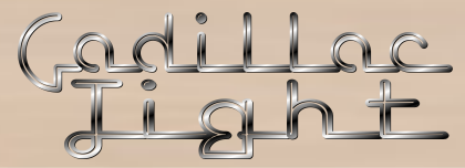
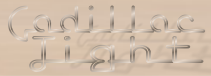
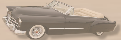
I did basically the same thing with the car to make the car shadow, skewing it until it looked right.
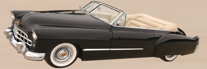
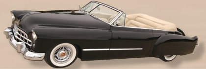
Anyway, I kept it simple and uncluttered, with a subdued, classic color scheme (it matches the car’s interior) with muted font highlights and a glossy, elongated, stylized car.
I’m pretty happy with the way it turned out, it didn’t take me a great deal of time, and I enjoy it every day when I visit Joe’s blog.

